_01JMZ4H43P2JR7Z62M1XDT4TBF.png)
Fully customize your notifications with CSS
In the world of e-commerce, Brand Consistency is the bedrock of credibility. When your social proof notifications match your site’s typography, color palette, and border styles, they don't just "show" sales they validate your store’s professional standards.
By leveraging custom CSS, you can move beyond basic settings and tap into Contextual Design, creating notifications that feel like a native part of your customer's shopping journey.
Not quite ready to write code? Learn how to use our no-code built-in design tools in our guide to Understanding the Theme Tab.
🛠️ Where to Apply Your Style
Fomo provides a dedicated space for your creativity.
-
Log in to your Fomo dashboard.
-
Navigate to Theme tab.
-
Click on the Custom CSS section/tab.
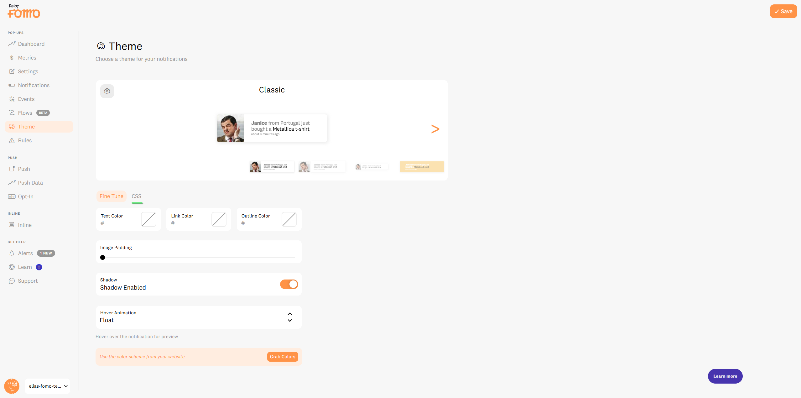

Whether you are performing a for a small tweak or building a from scratch, this is where the magic happens.
🧬 Understanding the Fomo CSS Anatomy
To style your notifications effectively, you need to know which "selectors" control which parts of the experience. We recommend using !important to ensure your brand styles take priority over default settings.
1. The Main Container
This controls the entire "box." Use it for background gradients, unique border-radii, or custom box-shadows.
- Selector:
.fomo-notification-v2-classic -
CRO Tip: Use a subtle shadow to create "depth," making the notification pop without distracting from your main CTA.
2. The Product/User Image
Control how your customer avatars or product thumbnails appear.
- Selector:
.fomo-notification-v2-classic .fomo-notification-image-wrapper img -
Creative Idea: Transform square images into "Modern Rounds" or add a colored border to highlight a specific product category.
3. The Content Text (Main Message)
The core of your message. Control the font family, size, and weight here.
-
Selector:
.fomo-notification-v2-classic .fomo-notification-content-wrapper p
4. Hyperlinks (The Click-Trigger)
This is the part that moves the user to the next stage of the funnel.
- Selector:
.fomo-notification-v2-classic .fomo-notification-content-wrapper a -
Engagement Tip: Give your links a bold color or a unique hover underline to increase the "Clickability" of your proof.
5. The Timestamp (Recency Proof)
- Selector:
.fomo-notification-v2-classic .fomo-notification-content-wrapper small
Here you can see an example:
And the CSS of it:
.fomo-notification::before {
  position: absolute;
  right: 0;
  bottom: 100%;
  height: 75px;
  width: 75px;
  content: '';
  background-image: url(https://fomo.com/assets/landing/product-tour/new/footer-fde111fde241e0716d16c2f18db717987a1dbd961d3fff540128ddd68b5873a1.svg);
  background-size: contain;
}

.fomo-notification::after {
  content: '';
  position: absolute;
  top: 0;
  right: 0;
  bottom: 0;
  left: 0;
  z-index: 1;
  border-radius: inherit;
  background: radial-gradient(circle at 30% 107%, #fdf497 0%, #fdf497 5%, #fd5949 45%,#d6249f 60%,#285AEB 90%);
}

.fomo-notification .fomo-notification-container {
  display: inline;
  background: #fff;
  position: relative;
  z-index: 2;
  margin: 3px;
  border-radius: inherit;
}
🧠 Strategic Design Directions
1. The Seasonal Pivot
High-growth stores don't stay static. They shift their design for Black Friday, Christmas, or Summer sales. Instead of coding from scratch every time, you can pull from our Holiday & Monthly Custom Theme Selector to instantly apply festive, high-converting styles.
See more custom themes we've created for our customers.
2. Dark Mode & High Contrast
If your site has a "Dark Mode" toggle, ensure your Fomo notifications follow suit. High contrast between text and background ensures Readability, which is essential for reducing the mental load on your shoppers.
3. Interactive "Hover" States
CSS allows you to add hover effects that react when a user’s mouse passes over the notification. A slight scale-up (transform: scale(1.05) ) or a subtle background shift creates a sense of Interactive Discovery, making the proof feel "alive."
🚀 Pro-Level CSS Best Practices
-
Typography Harmony: If your site uses a custom Google Font or Adobe Font, call it here. Matching your notification font to your site's header font is the fastest way to build Visual Trust.
-
The "Important" Rule: Because Fomo's default themes are powerful, always append your properties with
!important(e.g.,color: #ff0000 !important;) to ensure your brand's vision is the one that wins.
- Mobile Refinement: Use Media Queries to ensure your CSS looks just as sharp on a smartphone as it does on a desktop.
🚀 We’re Here to Help You Design
Fomo’s CSS flexibility is one of the features that makes us unique in the social proof space. We don't want you to look like everyone else we want you to look like you.
Need a design audit? Reach out to hello@fomo.com out to with your site URL and your vision.
Work with a Designer: Book a Strategy Call here to have one of our experts help you build a custom CSS theme that aligns perfectly with your store’s conversion goals. 🥳